|
POSTER SESSIONS - TSC 2011
P1: Philosophy
P2: Neuroscience
P3: Cog Sci/Psychology
P4: Physics/Biology
P5: Experiential
P6: Humanities
P7: Philosophy
P8: Neuroscience
P9: Cog Sci/Psychology
P10: Physics/Biology
P11: Experiential
P12: Humanities
POSTER SESSION PROGRAM:
SET UP:
Session 1: Wed,
- Early Set up by presenters 12:30 pm -1:30 pm
- Poster Session Open: 7:00 pm - 9:45 pm
- Posters must be taken down by 4 pm on Thursday
Session 2: Fri,
- Early Set up by presenters 12:30 pm -1:30 pm
- Poster Session Open: 7:00 pm-9:45 pm
- Posters must be taken down by 4 pm on Saturday
Presenters are asked to be available at their posters during their scheduled
session to discuss their posters with interested viewers.
All accepted abstracts will be published in the Conference Program and Abstract publication
2010 TSC Conference Poster by Natalie Geld

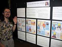
So what exactly is a Poster Board ??
 
Basic Guidelines
Poster Sessions at Toward a Science of Consciousness Conference
* SIZE:
The size of the poster board which will be supplied by the TSC Conference is 8 ft. (width) x 4 ft (height)
* ORGANIZATION:
Focus on the introduction, methods, results and discussion, summary, and references. Make a small-scale sketch of your poster to ascertain if all the points you want to stress as well as headlines, text, figures and tables, photos, etc., will fit into the dimensions allowed. The poster should start in the upper left hand corner and flow generally from left to right and from top to bottom. The title, author name(s) and affiliation are often at the top of the poster. If necessary, use letters, numbers, or arrows to indicate proper flow to the audience.
* CONTENT:
Do not crowd too much information into the presentation; concentrate on a few main points. Highlight trends and comparisons with simplified graphics and diagrams. Often it is better to use outlines and bullets than paragraphs. Avoid overwhelming the audience with too many numbers, words, or complicated graphs. Make certain your message is clear because people will study your poster while you are away.
* LETTERING:
All lettering should be easily read from a distance of 1 meter. Use a bold or semi bold typeface for headings and labels. Lettering for subheads and figure captions should be larger than that of the main text but smaller than the main heading. Text in upper- and lower-case letters is more readable than all capitals, but capitals for headings and labels are acceptable. Use sans serif type such as Arial or Lucida Sans for text. It is much easier to read than serif type such as Courier.
* MOUNTING:
Do not use double sided tape, glue or Velcro. Use push pins only. (these will be supplied)
To summarize:
DO use large, easy-to-read sans-serif letters.
DO include clear figures and tables.
DO NOT paste-up typed pages from a paper.
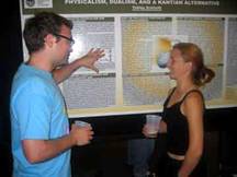
Remember that a Poster Session is more like an informal discussion. The discussion may begin with a question from an interested person. You may initiate a discussion by pointing out the particular figure that depicts the essential conclusions of your paper and allow questions and answers to flow from that point. Keep it conversational.
Wednesday evening posters can be set up after noon that day and taken down Thursday.
Friday evening posters can be set up after noon on that day and should be taken down Saturday afternoon.
TSC will provide the Poster Boards and push pins /thumb tacks
The Boards will have signage indicating The Session and Section Number
e.g. on WEDNESDAY PI - Philosophy
on FRIDAY P7-Philosophy
Author's Names, Title of Abstract, Session, Section/Classification will appear
in the Abstract Book and CCS TSC Website
|
