|
TOWARD A SCIENCE OF CONSCIOUSNESS 2008
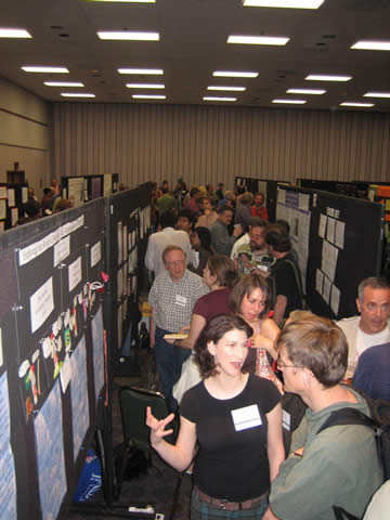
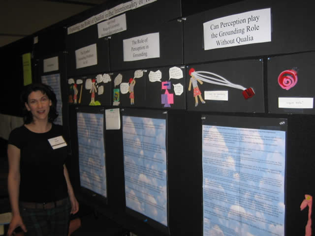
POSTER SESSIONS - (GUIDELINES and photos are at the Bottom of this Page)
First authors only listed here, co-authors and affiliation will be in conference program and abstract book
Some titles shortened
Poster Sessions P1 - P 6 - Wednesday April 9, 7:00 pm till 10:00 pm
P1: Philosophy
- Michael Cerullo, A Proposal for a Turing Test of Emotion.
- Carlos de Sousa, Emergence in the Global Neuronal Workspace Model:A Neurocognitive Hypothesis of Qualia
- Jerome Elbert, A Possible Functional Role for Qualia
- Stephen Anthony Farah, Can Cartesian Duality and Monism Co-Exist?
- Brian Fiala, The Phenomenology of Explanation and the Explanation of Phenomenology
- Eric Furcsik, The Inverse Mind-Body Problem
- Nataliya Garntseva, From Dualism to Materialism and Back Again?
- Ross F. Grumet, There is No Unconscious - Going Beyond Panpsychism: Consciousness As A Given of the Way the World is.
- Pia Ikonen, Free Will In The Human Brain. A Solution Of The Problem.
- Scott Jackson, “Retooling Sense Datum Theory: On the Existence of Abstract and Imaginary Sense Data”
- Alex Kiefer, Peripheral Self-Awareness and Higher-order Content
- Morey Kitzman, Contrasting Approaches to the Study of Consciousness
- Michal Klincewicz, Brentano and Husserl on Self-Consciousness Redux
- Uriah Kriegel, Space Soul Blues: An Argument for Phenomenal Intentionality
- Shikhar Kumar, Beyond Self-Reference: Taking Consciousness Seriously
- Caleb Liang, Perceptual Phenomenology and Direct Realism
- Jennifer Matey, Perceptual Constancy in the Representational Nature of Visual Experience
- Dylan Murray, The Phenomenal Concept Strategy Without Co-Reference
- Cathal O Madagain, What language does for consciousness: Socially fixed Signs and Consciousness 'that...'
- Max Payne, Two key questions about consciousness
- Stephen Pearce, Monism: A Phenomenological and Neuroscientific Perspective
- Anthony Peressini, Naturalizing Phenomenology and Intertheoretic Lessons from Physics
- Mark Pestana, Outline of A Metaphysics of Hedonic Tone
- Bryony Pierce, Consciousness as the Interface between Cognition and Emotion (‘ICE Theory’)
- Matthew Piper, Complexity Theory and Theories of Consciousness: the Supervenience Hypothesis: Preface to a Theory of Complex Neurofunctionalism
- Anand Rangarajan, A Postmodern Physicalism That Can Accommodate Experience
- Kristin Schaupp, Consciousness and Laws in the Physical World
- Roger C. Schriner, Strong Representationalism and Selective Attention
- J.R. Shrader, Reassessing the Incompatibility of Ontological Emergence and Microphysical Realization: A Way to Advance the Debate over Nonreductive Physicalism?
- Arthur Smith, It’s About Time
- Khaldoun Sweis, Property Dualism Entails Substance Dualism
- Kimberly Van Orman, The Problem of Explanation: A Call to Reject the Hidden Reduction in Non-Reductive Materialist Arguments for the Explanatory Gap
- James Clement van Pelt, Dark Experience: methodologies for comprehending the experiential domain
- Vadim Vasilyev, Interactionism is compatible with causal closure
- Dmitry Volkov, Is Dennett's Multiple Drafts a Verifiable Hypothesis?
- Christian Whittall, Toward a Consciousness of Science: Historical Models for a New Imaginative Scientific Method
- Jerry Yang, Does Self-Representational Theory of Consciousness necessarily involve a dual content structure?
- Benjamin Young, Mind the Phenomenal Concept
P2: Neuroscience
- Joel Alexander, The Effects of a Self-Evaluation Task on the P300 Event Related Potential
- Erhard Bieberich, Update on Recurrent Fractal Neural Networks: From Anesthesia to Quantum Zeno Effect in Single Neuron Consciousness
- Maria Brincker, The New Empirical Muscles of the Theory of Ideo-Motor Action
- Mike Collins, Firing Rate and Periodicity as Candidate Representational Codes in Somatosensory Cortex
- Nancy Craigmyle, A Possible Role for the Integrated Norepinephrine System in the Continuum of Consciousness
- Erik Engdahl, Autism Spectrum Disorders - Neurological Abnormality and/or Cramped State of Communication Shutdown?
- David Gelles, The Neural Correlates of Emotions - A Neglected Subset of the Neural Correlates of Consciousness.
- Jodi Lasky, The Neurobiology of Tantric Sexual Pleasure
- Alfred Levinson, Can Global Workspace Theory and State Dependent Network Theory Explain Libet?
- Myrto Mylopoulos, Consciousness Out Of Control
- James Pagel, The Eclipse Horizon of Dream
- Ashley Willis, Our eyeballs - dual vibration / vision sensors
- Rowe Young, Lost in Space- "Inverted Positioning Sensation"(IPS):as of yet Unidentified Contributing Cause For ADHD and/or LD
P3: Cog Sci/Psychology
- Robert Benefield, Quantitative and Qualitative Analyses of the Ascribed Characteristics of Spiritual Discernment: Higher Consciousness or Self-Deception?
- Kristen Corman, ‘I’m not thinking of you.’ Poetic metaphor: intrinsic inhibited during extrinsic, cross-modal, hand-eye, ‘conscious’ sensory engagement: ‘losing the self’ while gazing at hand drawn, beloved faces.
- Fernando de Pablos, Consciousness during dreaming: Is there anything more than an anomalous state?
- Carl Flygt, Linguistic Determinism and the Technological Singularity
- Ellen Fridland, Three Failed Arguments (Dretke, Fodor & Pylyshyn)
- David Glanzer, Implementation of an Adaptive Resonance Network Model of Empathy
- Anastasia Gorbunova, How to Lose Yourself in Yourself: Proto-, Meta-, and Self-Consciousness.
- Frank Heile, Two Conscious Beings from Two Different Representational Loops
- Ron Karr, Consciousness and Memory
- Lyle Long, The Prospects for Creating Conscious Machines
- Robert Mays, Phantom Limb "Touch" Suggests That A "Mind-Limb" Extends Beyond the Physical Body And Can Interact with Reality, Producing Physiological Sensations
- Phil McClung, Understanding Psi and Non-Psi Dreams
- David Murphy, "Consciousness and Emotions: Radical or Moderate Embodiment?"
- David Saunders, How the human brain generates human nature, language, ethics, morality, and the senses of value and meaning.
- John Selden, Consciousness in Mathematical Reasoning
- Meredith Tromble, Emergence and Collective Creativity
P4: Physics/Biology
- Carlos Acosta, Organic Reasoning Systems
- Amna Alfaki, Consciousness: New Definition
- Michael E. Arth, U N I C E
- Vadim Astakhov, Mind Uploading and Resurrection of Human Consciousness Is There a Place for Physics and Computer Science?
- Adam Atkin , On Conscious Development of Mind
- Nathan Batalion , Naturolism: Seeing organizing principles of life and consciousness at the depth core of nature – rather than what’s robotic/mechanical/mathematical.
- James Beichler, The Historical Context of Consciousness Studies as a Research Tool
- James Beran, Image-based Information About Consciousness: Choosing Models for Effective Diagnosis and Therapy
- Matti Bergstrom, Tunneling - a Phenomenon in the Brain of an Observer of Physical Objects
- Gerard Blommestijn, Two Meanings of "Unity of Consciousness" in Relation to Quantum Mechanics.
- Robert Boyd, The SubQuantum Foundations for the Informational Essence of all Consciousness-Related Phenomena.
- R. W. Boyer, The Top Down Consciousness-Mind-Matter Ontology
- Steven Brown, Reentrant Emergence
- Bruce Carruthers, A Clinical Medicine based on the Holistic Proprioceptive Nature of Symptoms
- Katherine Creath, Systemic Properties of Biophotonic (ultra-weak photon) Emission in Biological Systems: Eevidence of Interactions with the Human Biofield
- Albert Fonda, What's needed to move 'Toward a Science of Consciousness'
- Lee Frank, Mystery of the Hemispheres: An Evolutionary Loop
- Sanjay Ghosh, Mind Particles: See it by Physical Instruments.
- Karen Gilbert, Communicating with the Consciousness of Cancer
- Anatoly Goldstein, Modeling Extra-Sensory Perception Using Split-Complex Spacetime
- Alex Hankey, Quantized Instability Fluctuations Satisfy David Chalmer's Conditions for Non-Reductive Models of Information Spaces of Consciousness
- Syamala Hari, Eccles's Psychons Can Be Zero-Energy Tachyons
- Christopher Holvenstot, Does the Brain Produce Conscious Experience or Merely Enhance and/or Articulate It?
- Huping Hu, Concerning Spin as Mind-pixel: How Mind Interacts with the Brain through Electric Spin Effects
- Perry Justin, A Grand Unified Theory of Consciousness? Why Understanding and Explaining Consciousness Will Inevitably Lead To One
- Marianthe Karanikas, Mind-Body Medicine as Internal Persuasion: The Structural Coherence of Emotional Coloring and Phenomenal Tint
- Kerk Kee, Toward a Bio-Cultural Model of Human Consciousness: Nineteen Propositions and an Interdisciplinary Framework
- Werner Krieglstein, How to Feel and Act Like an Amoeba: Neo-psychism, Self-Organization, and Collective Orchestration
- Walter Matreyek, The Cybernetics of Life/Consciousness
- Monica Michalski, Mind, Movement and Health as Emergent Properties of Patterns in the Neural Net
- Jim Nystrom, Universe as Computation, Modern Aether Theory, and the Funda-Mentalistic Mind
- Aaron Pearl, Neuroethical Concerns Raised by Religious Experiences in Epilepsy Management
- Kala Perkins, Resonant Emergent Identity: Choreography of the Cosmic Human
- George Schoenfelder, Toward a Gene-Expressed Basis of Consciousness
- Thomas Schumann, Quantum Theory, Reality, the Dream Metaphor and the Subjective Reduction of the Wave Function
- Francis Schwanauer, Inference at the Mercy of the Selection of the Implying
- Susan W. Schwartz, Colors of Healing: Spectral color as a non-local agent of transformation in localized human consciousness
- Ron Shane, The Neurobiology of the Mind's Eye
- Richard Shank, A Theory of Consciousness Based on the Concepts of Force Carrier Particles and Superposition, and Electromagnetic Fields Generated by Neural Networks
- Richard Steiner, DNA: Consciousness to Unconsciousness Memory
- Erick Von Schweber, Aspect-oriented quantum monism and the hard problem
- Juliane C. Wilcke, Determining how best to study the evolutionary function of consciousness
P5: Experiential
- Judith Blackstone, Realization Process: The Relational Potential of Nondual Awareness An Experiential Workshop
- Whit Blauvelt, Sense Symmetry: A Method for Tuning Consciousness's Scope
- Jeffrey Brooks, The States of Consciousness
- Maureen Caudill, Eliciting the Paranormal in the Lab: Making the Paranormal Normal
- Jorge Gonçalves, How to Explain the Fringes of Consciousness?
- Ronnie Hawkins, Crossing the Corpus Callosum: Clarifying Our Ontology, Redirecting Our Agency
- David Holan, The Illusion of Control: A Dynamic Model for Psychotherapy
- Reginald Humphreys, Hypnosis And Anthroposophical Medicine
- Peter Lloyd, Basic Conceptual Problems in Parapsychology
- Olga Louchakova, Reconstitution of the Self During the Study of Advaita Vedanta (Traditional Indian Teachings of Non-Dual Consciousness): Phenomenological Investigations
- Rick Roark, A Simple Description of Consciousness
- Amanda Seipel, Observer Theories: The Next Step
- Charles Shang, A Unified Biological Model of Meridian and Chakra Systems with Confirmed Predictions
P6: Humanities
- Edouard Asseo, Theory of Consciousness Theory of Knowledge
- Walter Cruttenden, Cycles in Consciousness - An Ancient View
- Mathew Gendle, From the Spirit to the Synapse: Creating and Implementing a Unique Interdisciplinary Consciousness Studies Class for Undergraduates
- Linda MacDonald Glenn, Consciousness, Cognitive liberty, and Culpability: An Examination of Constitutional Law Issues
- Jeremy Horne, How Towards a Science of Consciousness Formed
- Gerald Katzman, Strategies for Countering the Teaching of Hatred to Children
- Oded Maimon, We show that the contradiction in consciousness definition by different schools of philosophies is a necessary condition for the unified concept of consciousness! We then present a unified definition.
- Mark Moyers, The Philosophy of Immunization, which value do you choose as the "highest"?
- Jordan Olischefski, Individual Differences in Video Game Play and Presence
- Ana Rosa Richardson, Change in the energetic matter of my human body following the new order of my energy body, my dream body
- Sylvain Rouanet, From care of the self to the care of others : an ethnologic inquiry of a Tai-chi-chuan school.
- Stephen Schafer, The Psychecology Game I: Using story-based, Role Playing Games (RPGs) to capture veridical data on subliminal states of being (An interdisciplinary correlation)
- Josiah Shindi, Visions as a special form of altered state of consciousness
Poster Sessions P7- P 12 - FRIDAY April 11, 7:00 pm till 10:00 pm
P7: Philosophy
- J. Kenneth Arnette, Boundary Conditions for Theories of Consciousness: Satisfaction by a Dualistic Interactionist Theory
- Sergio Basbaum, Perception, Language and Culture in a Semantic Turn: Consciousness as Meaning
- Jesse Butler, Kinds of Introspection: A Pluralistic Model of First-Person Knowledge of Consciousness
- Chien-Hui Chiu, The Brand New Physical World of Swamp-Mary
- Peter Ells, Mental Causation
- Stewart Erik, Consciousness Tuning
- Diana Gasparian, Why the Mind is the Only Problem of the Mind-Body Problem?
- Fairlamb Horace, Explaining the Explanatory Gap: Beyond Monism and Dualism
- Shun-Pin Hsu, Can’t We Solve the Mind-Body Problem?
- Hyo-eun Kim, Representational Content and the Knowledge Argument
- Ying-Tung Lin, Objection to Quining Qualia
- Ken Marton, Resolving The "Hard Problem" Within The Circuitry of an Individual's Brain: Binding The Phenomenal Qualities of Interiority and Exteriority
- Alexander Matckevich, Some difficulties of naturalistic approach
- John Morrison, Consciousness and Color Physicalism
- Joel Parthemore, Concepts Within Consciousness: A Model of Concept Acquisition and Application as a Process of Layering and De-Layering
- Tatiana Postnikova, Intentionality and Non-Intentionality of Consciousness
- Sean M. Smith, Being a Non-Reductionist about Consciousness when Modal Arguments Fail: An examination of Thomas Metzinger's Dynamicist-Connectionist attack on Qualia and a Reply in Favour of Neutral Monism
- Justin Sytsma, Two Conceptions of Subjective Experience
- Keith Turausky, Heterophenomenology’s Linguistic Idealism
- Orlin Vakarelov, General Situated Cognition
- Laura Weed, Multiple Drafts or Anatman? Neuroscientific and Buddhist Conceptions of the Self and Language
- Alexander Yakhnis, Why a Turing Machine Cannot Remote View? Alexander Yakhnis, PhD-ayakhnis@hotmail.com
- Yuan-Chieh Yang, Externalism and the self. Does the self depend on representation?
- Chen Yu-Jen, Transparency Explained
P8: Neuroscience
P9: Cog Sci/Psychology
- Peng Chien, The Solution to the Problem of the Time of Consciousness: What is Needed is “Time,” not “Representation”
- Nivedita Gangopadhyay, Can Attention Be the Key Towards an Understanding of Perceptual Consciousness?
- Jacob Hirsh, The Weight of Being: Psychological Perspectives on the Existential Moment
- Dr. Gregory Holler, Relations of Hypnotic Susceptibility, Absorption, Imagery, Sexual Fantasy, Sexual Daydreaming, and Social Desirability to Sexual Satisfaction
- Ling-Fong Kuo, The Mirror Test Can't Tell Us Whether Animals Have Self-Consciousness Or Not
- Stefania Mereu, Unconscious Endogenous Orienting of Attention Reflects An Automatic Shift of Attention.
- Gabriel Mograbi, Between the Spider's Net and the Working Theatre
- Stephen Morgan, Do Emotional Cues Influence Shifts of Visual Spatial Attention?
- Jack Sam, An Intertwinement of Time & Karma: Phenomenology of a High-Speed Racecar Crash
- Richard Sieb, The Discrete Generation of Consciousness
- Knud Thomsen, The Consumption Analysis Loop in the Ouroboros Model, Basis for the Allocation of Attention and for the Emergence of Consciousness
- Julie Troyer, Troyer Level of Consciousness Inventory(TLOCI): Measuring the invisible.
P10: Physics/Biology
- Marcus Abundis, A General Model of Human Consciousness (Global Cultural Evolution)
- Azzam AlMosallami, The Comalogical Theory: The Philosophy of The New Relativity Theory Theory
- Uzi Awret, What Could Possibly Count as a Physical Explanation of Consciousness?
- Ann Baldwin, Relaxation and Mental Effort Self-Monitoring for Rehabilitation
- Massimo and Manuele Bondì, Experimental Demonstration of the Pathogenesis of the Coma, Through the Unified Synaptic Channel Collapse. Physiological - Clinical and Quantum-Electrodynamics Considerations.
- Michael Brill, The Relationship Between Unconscious Abandonment Issues and Mental, Emotional, and Physical Health
- Steve Cousins, Natural Selection and the Design of Consciousness
- Tony De Luca, A Systems Engineering Approach to Perception
- Igor Dolgov, Broadening Inclusive Fitness Theory: The Evolution of Unreciprocated Altruism among Non-Kin Humans.
- Raynal Dunlop, A Preliminary Approach to an Alternative Hypothesis of Reality and Consciousness.
- Marcos Estellita Lins, Quantum Duality, Theory of Mind and Personality Assessment Applied to Social Meta-Diagnosis: The Case of Cognitive Mapping for Diagnosing the Safety Issue in Rio de Janeiro
- Lorna Green, Consciousness and the Scheme of Things. A 'New Copernican Revolution.'
- David Holmes, The Theory of Neurobioluminescence in the Evolution of Sensorium Consciousness -- A Synopsis of Psyche's Palace: How the Brain Generates the Light of the Soul
- Adrian Klein, The SubQuantum Foundations for the Informational Essence of all Consciousness-Related Phenomena.
- Daniel Krieglstein, Emotion: The Building Block of Panpsychism
- Prasanna Kumar , The Interconnectedness of Consciousness and Activities Performed Explained by Quantum Physics
- Aaron Levisohn, Road Rage: An Indicator of Evolutionary Augmentation
- Michael Lipkind, Consciousness Ontogenesis: the Radical-Emergence-versus-Panpsychism Dilemma and its Solution by Means of an Irreducible Field Principle
- Raymond Noack, Solving The “Human Problem”: The Frontal Feedback Model
- Alan Oliver, The dynamics of imaginary energy states in the human hair shaft, modelled on the neurone in consciousness, as they relate to changes in health and disease.
- Jean Ratte, Embryology and Vascular Correlates of Consciousness. From Quanta to Qualia, From Semiotics to Semantics.
- Edward Ray, What If This Universe Were The Only One!
- Alan Rosen, The Psychophysical Conversion of “Consciousness” Into Physical Reality. The Philosophical Difference Between the Metaphysics of Consciousness and the Physics of Physical Reality.
- Vikas Shah, Does the brain implement some form of delay coordinate embedding?
- Gao Shan, A quantum theory of consciousness
- Sugiyama Shigeki, Primitive element transformed and reflected method in consciousness
- Avtar Singh, A Universal Approach to the Problems of Consciousness & Mind
- Paul Storey, Consciousness in Engineering Units
- Gottfried Suessenbacher, “Phylogenetic” Amnesia - Precondition of Self-consciousness?
- Sandgren Tim, Vortex based mathematics as a clue to understanding the zero point field?
- Mike Vandeman, The Nature of Consciousness and the Meaning of Life
- Ximena Velásquez, Quantum Brain or classic brain, a review
- John Yates, Quantum Interrogation, the McTaggart A Series, and the Many Bubble Interpretation
P11: Experiential
- Abdellatif Abujudeh, "Is Consciousness Distinct From Attention?"
- Daniel Beal, A Boolean Algebra of Ego Mechanisms of Defense
- Jorge Davila, Intentionality, the Peri-personal Space and the Psychotic Experience
- Caroline Duthy, A Psychoanalytic Contribution to the Theory of Consciousness
- Mary Flores, Measuring the Effects of Intentionality in Energy Practitioners on Extra Low Frequency Magnetic Fields
- Mary Larrabee, Moving Consciousness: From Zen's Immediacy to Deleuze's Immanence
- Roulette Smith, The ‘Really Hard Problem’ Becomes Even Harder – and More Interesting: Disambiguating Belief, Awareness, Reality, Experience and Neediness in Persons with Aberrant Common Sense
- Thomas H. Tower, An Experiential Approach to Second Person Inter-Subjective Collaborative Inquiry: The Integral Game
- Zoltan Veres, Intentionality, Attention and Consciousness
- Laurence Victor, We are the Worlds, Coupling via Semiotic Structures : Reframing Reality for Survival
- Burton Voorhees, Stairways to Heaven: The Cultural Construction of Enlightenment
P12: Humanities
- Alejandro Manuel Alcaraz Ramirez, Quantum Philosophy, A Social Approach
- Jesse Bettinger, Framing a Philosophical, Cosmological, and Theological Anthropology of Consciousness (as seen by the Philosopher-Coach)
- Sara Bizarro, The Invasion of the Body Snatchers
- Greg Brack, Introducing Students in the Helping Sciences to Quantum Mechanics, Chaos/Complexity Theory, and Consciousness
- Ana Eva Iribas-Rudín, Altered States of Consciousness and Visual Arts: Salvador Dalí, Henri Michaux and Antoni Tàpies
- Pamela Reeve, Evolution, Neuroplasticity, and the Beatific Vision
- Carlos Risco Risco, Immortality versus resurrection: Xavier Zubiri´s final mistake
- Richard Sorenson, Liminal Consciousness
POSTER SESSION PROGRAM:
Poster Sessions will be held Wednesday evening, April 9th and Friday evening, April 11th from
7:00 pm to 10:00 pm with a cash bar. Poster presentations will be selected from submitted abstracts. All accepted abstracts will be published in a Journal of Consciousness Studies - Conference Abstract publication.
Guidelines:
Poster Sessions at Toward a Science of Consciousness Conference
* SIZE:
The size of the poster board is 8 ft. (width) x 4 ft (height)
* ORGANIZATION:
Focus on the introduction, methods, results and discussion, summary, and references. Make a small-scale sketch of your poster to ascertain if all the points you want to stress as well as headlines, text, figures and tables, photos, etc., will fit into the dimensions allowed. The poster should start in the upper left hand corner and flow generally from left to right and from top to bottom. The title, author name(s) and affiliation are often at the top of the poster. If necessary, use letters, numbers, or arrows to indicate proper flow to the audience.
* CONTENT:
Do not crowd too much information into the presentation; concentrate on a few main points. Highlight trends and comparisons with simplified graphics and diagrams. Often it is better to use outlines and bullets than paragraphs. Avoid overwhelming the audience with too many numbers, words, or complicated graphs. Make certain your message is clear because people will study your poster while you are away.
* LETTERING:
All lettering should be easily read from a distance of 1 meter. Use a bold or semi bold typeface for headings and labels. Lettering for subheads and figure captions should be larger than that of the main text but smaller than the main heading. Text in upper- and lower-case letters is more readable than all capitals, but capitals for headings and labels are acceptable. Use sans serif type such as Arial or Lucida Sans for text. It is much easier to read than serif type such as Courier.
* MOUNTING:
Do not use double sided tape, glue or Velcro. Use push pins only.
To summarize:
DO use large, easy-to-read sans-serif letters.
DO include clear figures and tables.
DO NOT paste-up typed pages from a paper.
DO NOT clutter the poster with too many details. Posters should be understandable - even in the absence of the author(s)!
Remember that a Poster Session is more like an informal discussion. The discussion may begin with a question from an interested person. You may initiate a discussion by pointing out the particular figure that depicts the essential conclusions of your paper and allow questions and answers to flow from that point. Keep it conversational.
Wednesday evening posters can be set up after noon that day and taken down Thursday.
Friday evening posters can be set up after noon on that day and should be taken down at the end of the session at 10:00 p.m. Friday because the boards will be removed Saturday morning.
Poster Boards Provided By:
US EXPO & convention services
1859 W. Grant Road Suite #107
Tucson, AZ 85745
US +1 5205733200 Call phone
US +1 5205733400 Call fax
admin@usxpo.com attn: Administrator


|